Listed Townhouse

Oxfordshire

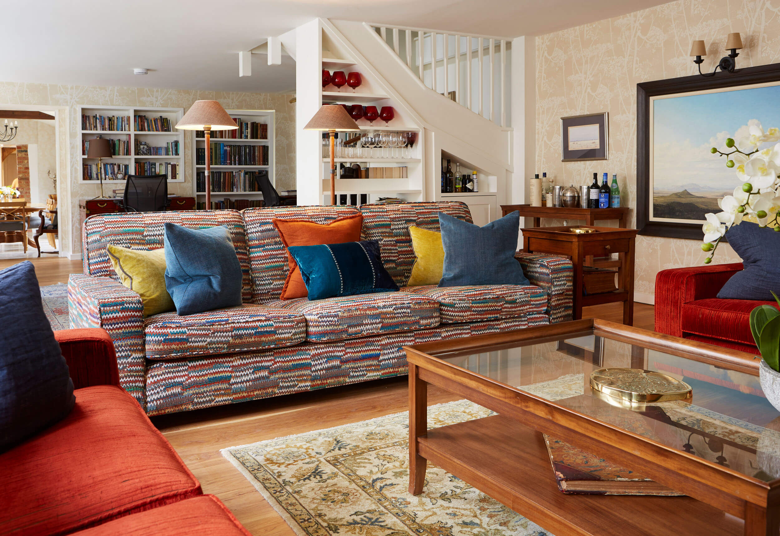
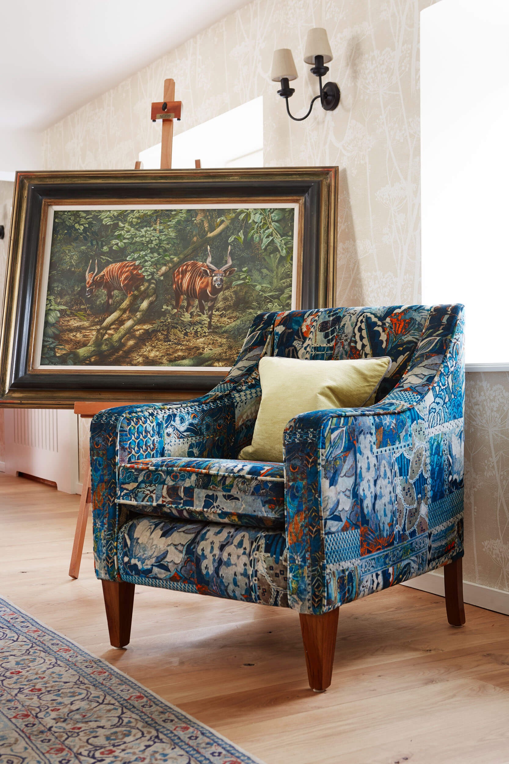
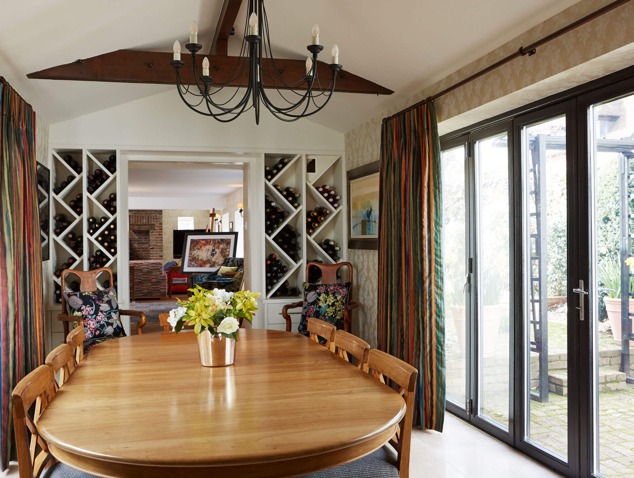
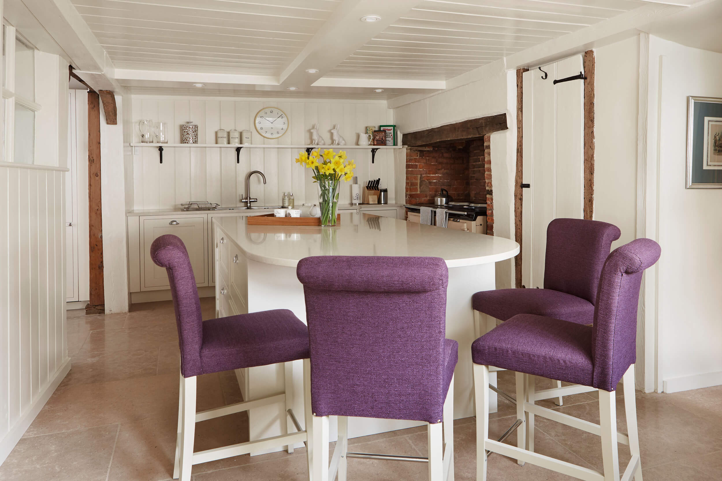
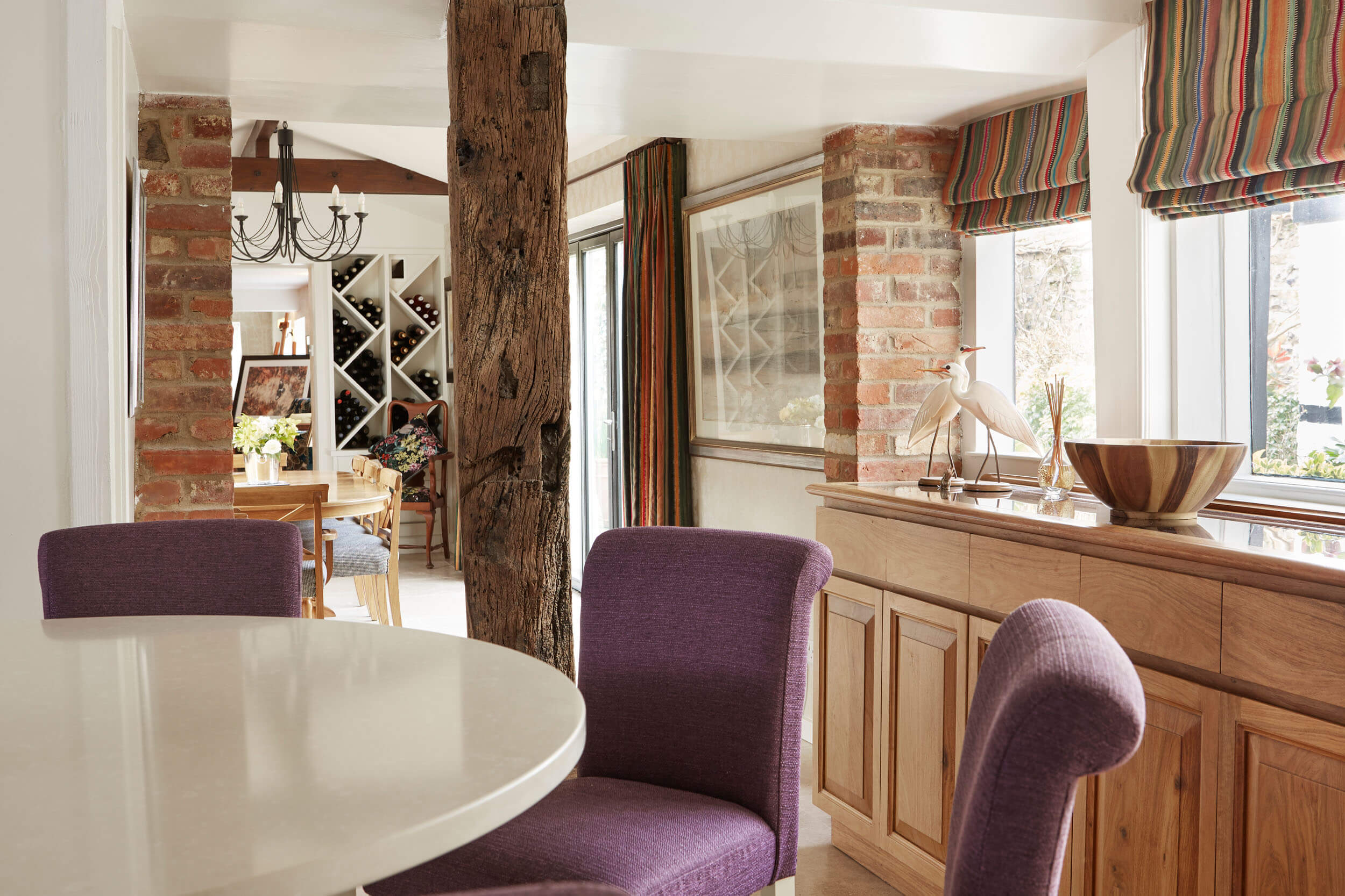
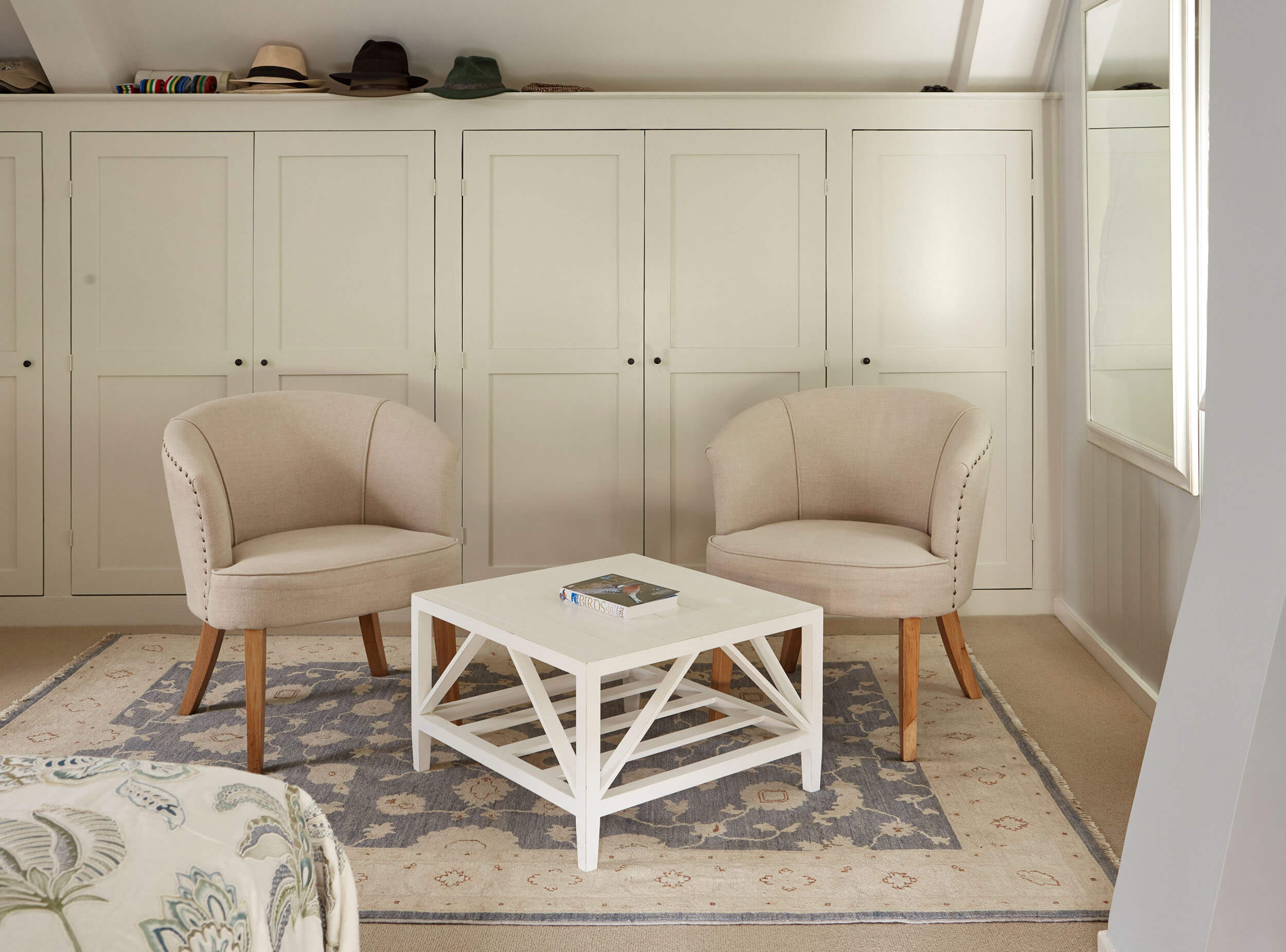
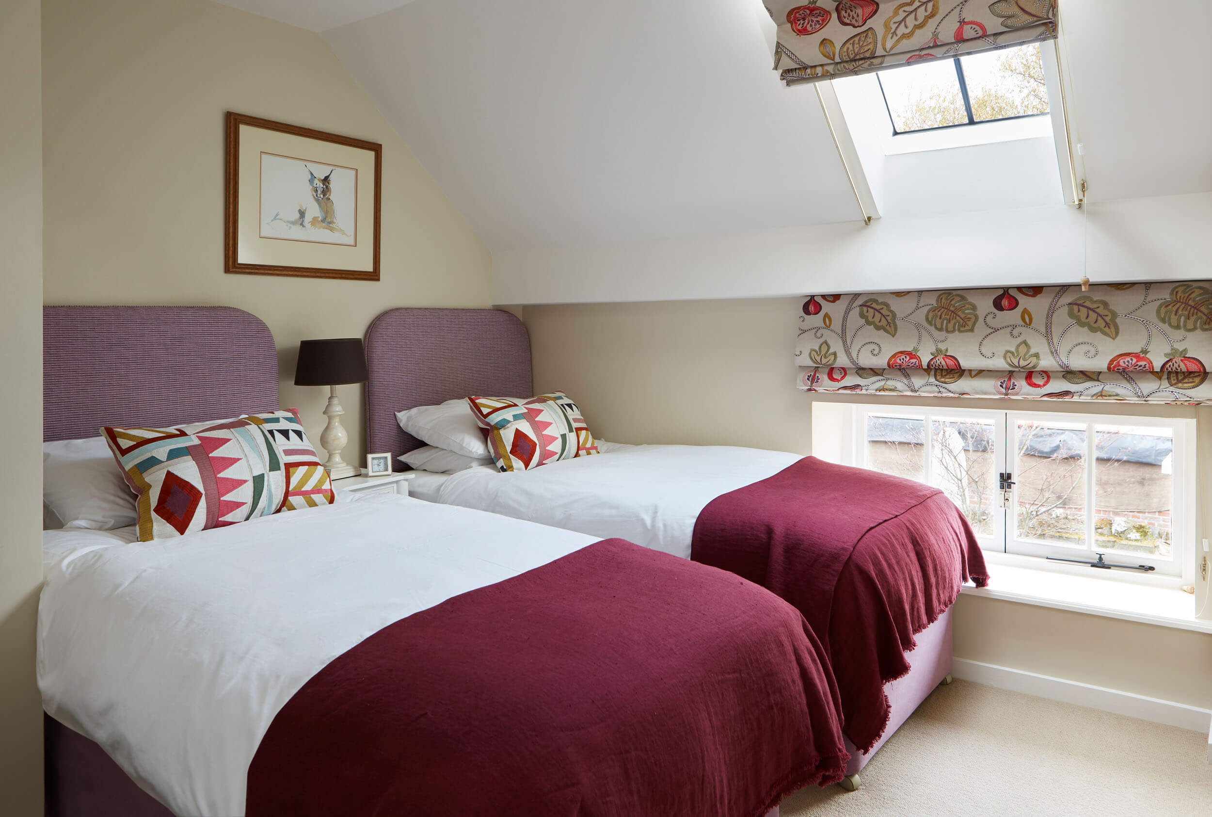
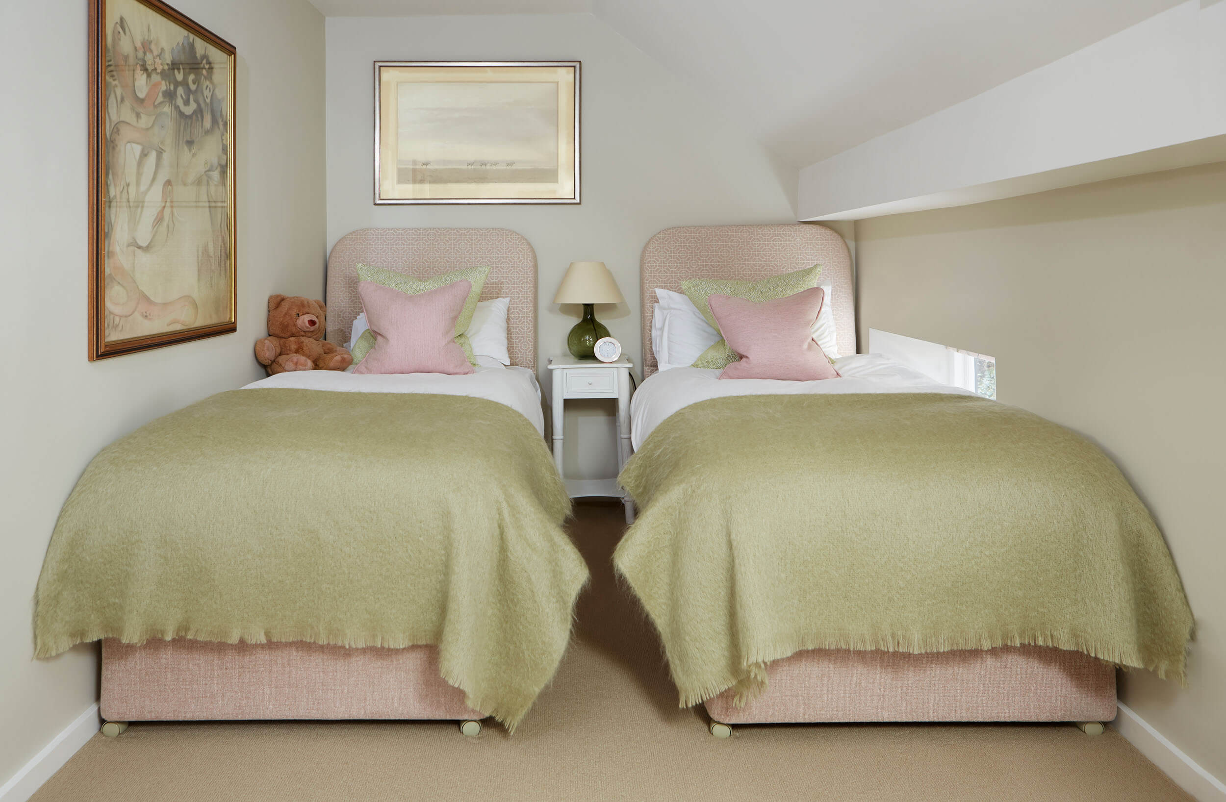
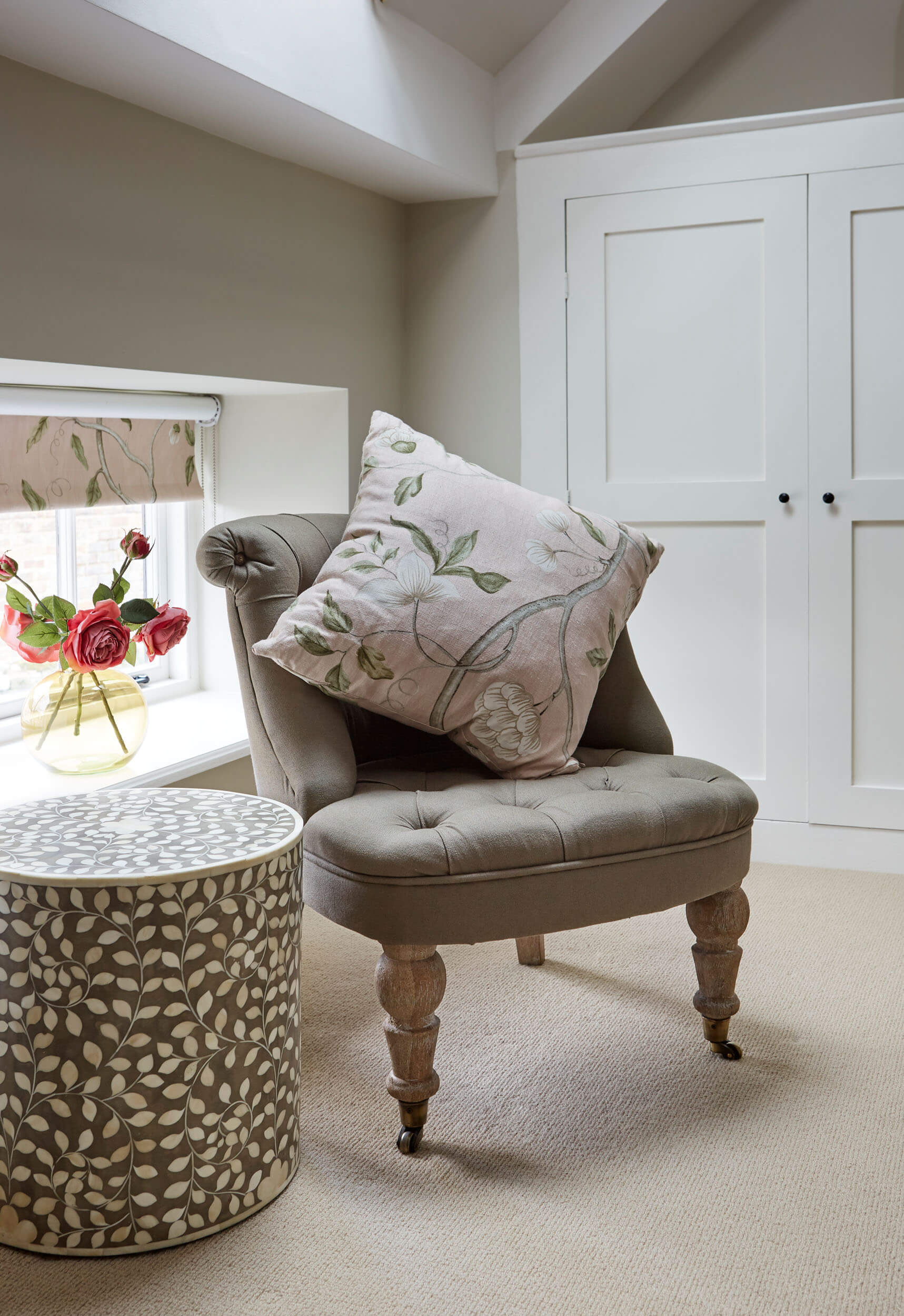
We were first approached by the owner of this property during early summer, 2010. At the time the client and his wife were living in Cape Town. The brief was to devise an interior style that would sit well in a property that architecturally, originated hundreds of years ago and, as so often is the case, had additions added in more recent years. This was to be a project that had a relatively short lead-time. We were required to completely furnish the property by Christmas, ready for couples first visit.

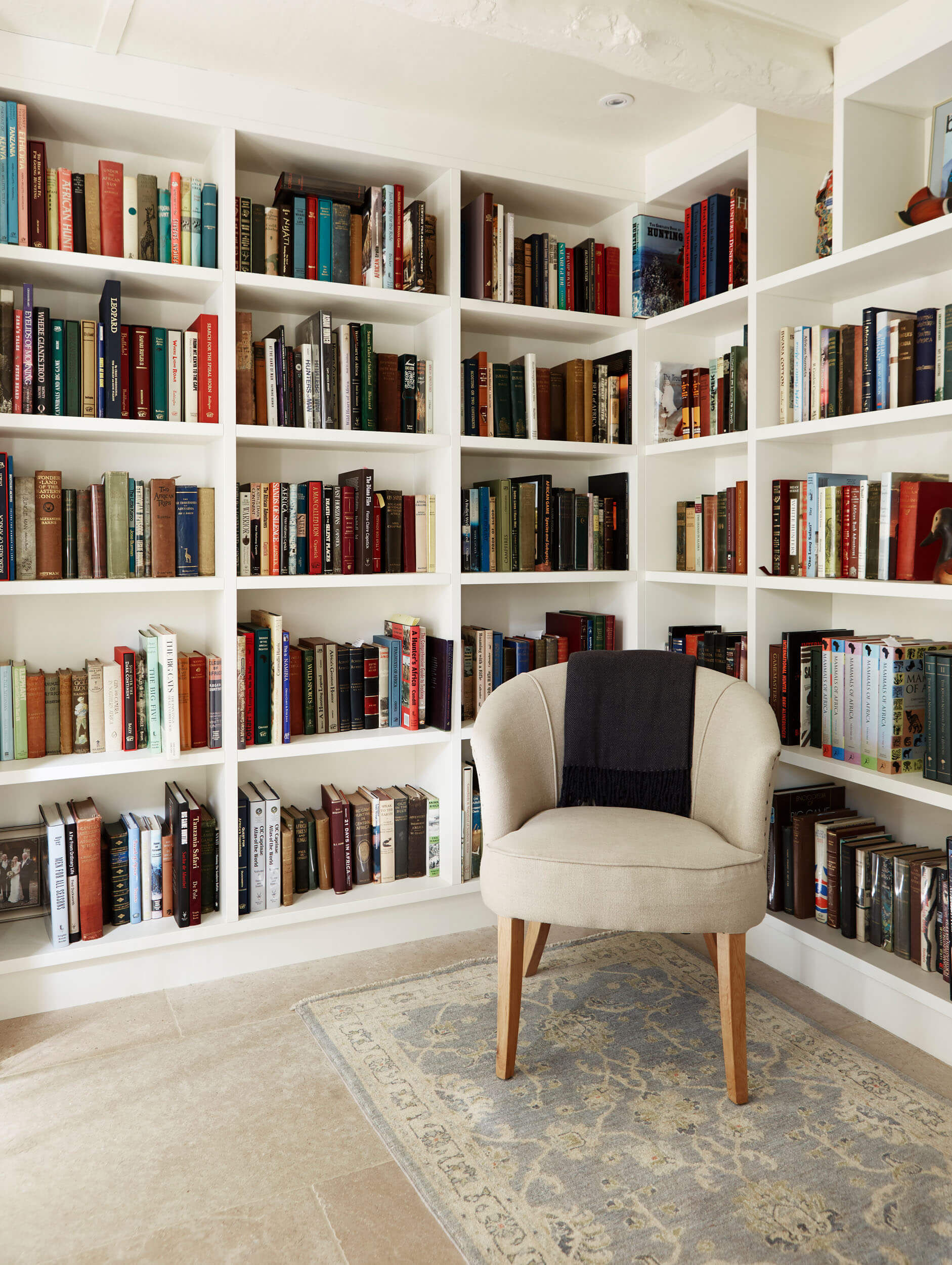
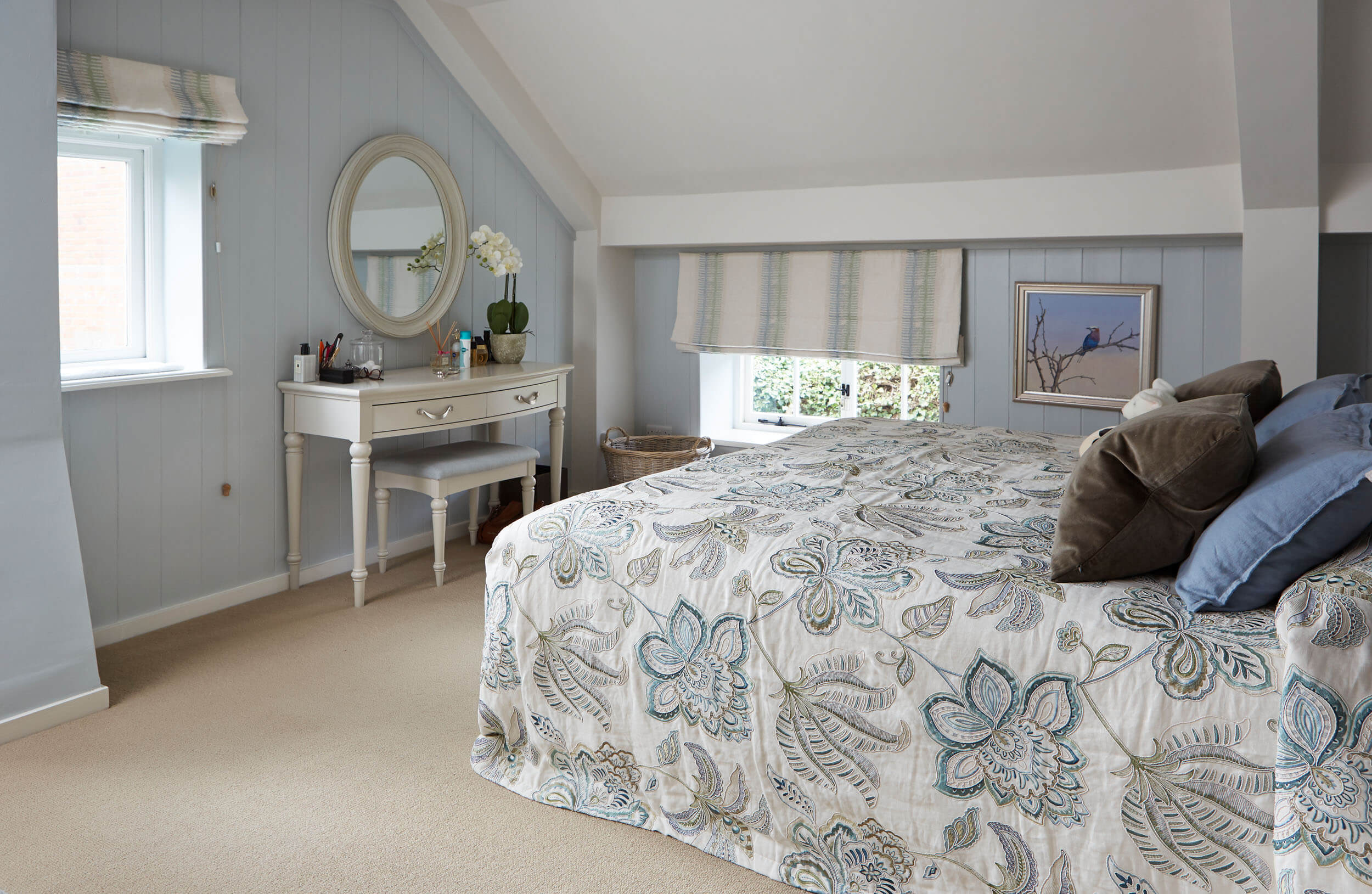
During the 1st week of December, as planned, the property was handed over to the clients. We had undertaken decorating throughout, supplied and installed all furniture, the beds were made up, the rooms dressed and the kitchen complete with fine china, cutlery and glassware.

A Major Renovation

Fast track 9 years later, after numerous visits and time spent at the property, our clients made the major decision to up sticks and leave South Africa. A decision that meant they would retire to the UK and make Henley their permanent home. We were naturally delighted to be asked to undertake a major renovation of the property, which was would now include a reconfiguration on the ground floor, new stone floors, a new kitchen, new bathroom layouts and sanitary ware, a library, and a study.

In addition the property needed re-wiring and a new heating system. With the design of the new interior scheme we were asked to include some favourite pieces of furniture, rugs and artwork, which were due to be shipped to the UK from South Africa. The process began with sifting through photos of the owners previous home. Noting individual pieces of furniture and artwork. Understanding the sizes and scale of each item and deciding how we would introduce them into our new scheme. We created a catalogue of the items available.

The main sitting room in this deceivingly spacious home is situated at the rear of the property and overlooks the garden. Within the original scheme many years earlier, we had included a large scale wallpaper by Coles and Sons, which the clients loved. At the very beginning of the design process they asked if it would be possible for this same design to still be incorporated in the new scheme. The room is dual aspect, where natural light pours through the many windows and because of this we were able to introduce, a gloriously rich colour palette. A sumptuous deep textured velvet in burnt orange was chosen to cover two well proportioned sofas.

These were positioned either side of the large reclaimed brick, inglenook fireplace. With this, we teamed a multicoloured material in colours of teal and spice, to upholster a third sofa. One of the rugs, that has beed shipped from South Africa, was placed to nestle on the newly refurbished oak floor between each of the two sofas. The colour scheme was completed with ochre silk lamp shades, an ochre and blue bespoke cushions. The generous sofas created the perfect place to relax, and take in the large landscape paintings that hang on the walls opposite. Paintings of wide landscapes, give the opportunity to become lost in memories of the owners homeland.

In a separate space, close to the study, two Claude chairs are positioned, both are upholstered in an abstract velvet, introducing a rich mix of colours, ink blue, teal and cinnamon. Almost echoing the rich vegetation of the antelope paintings sitting on the easel behind. An inviting place to sit curled up with a book.

The dining room sits between the kitchen and main living area, and over looks a courtyard. It is another area of the property that basks in natural light. Here and through to the kitchen we opted to install a large format Buscote limestone from Artisan of Devices, in a seasoned finish. The creamy softness of the limestone sits quietly, at ease with the beautiful texture and colour found in the original beams. On the walls we chose a subtle damask wallpaper to introduce changing textures and at the windows full length curtains, made up in the embroidered ‘Bohemian Stripe’ from Mulberry, hung from hand forged bronze poles.

The original panelling on the walls and ceiling of the kitchen were painted Wimborne White, perfect with the limestone floor. Simple shaker style cupboards, only at base height and a large central island. A place for the family and friends to come together for informal dining. The open shelves with wrought iron brackets at the opposite end of the kitchen draw the eye and add a decorative feature.

In what had previously been an awkward, dark utility space for coats and storage we created a library. Custom made wall to wall and ceiling to floor book cases were designed, commissioned and installed. The result, a light and area room and the ideal place to house our clients expansive book collection.

In another small and closed zone we created a boot room Creating plenty of storage for coats, boots hats and gloves. All things for the great outdoors!

The master bedroom is nestled away in the eaves, where we wanted to create a peaceful haven. It is a pretty room with windows that overlook the garden. When designing the scheme we selected a soft, gentle whisper of blue paint colour from Mylands, to paint the panelled walls, an excellent colour which sits gently against the pale corn loop pile carpet.

The previous scheme had included a bedspread, something that over the years the clients had become extremely fond of but that was now looking tired. To replace it we found an exquisite large floral embroidered material which we had made into a stunning bedspread. Finally to complete the scheme we we selected an embroidered striped fabric from Kravet to make roman blinds for each of the windows.

We chose a pretty blue rug the owners had shipped to the UK from their previous home and created a seating zone in front of a run of wardrobes.

The scheme for this guest bedroom began with the stunning abstract fabric by Pierre Frey, we used to create pillow cushions. Teamed with pale yellow walls, Lilac headboards, the colour pallet continues with raspberry, greens and reds. Crushed raspberry bed throws were chosen to complete the dressing of the beds.

To create a very pretty guest bedroom we put together soft ice cream colours and specified textiles to reflect soft pattern and texture. A soft sheen on the pale pink geometric weave used on the headboards sits happily with the pale pink textured weave on the upholstered bed bases. The tactile sage mohair throws softly draped at the ends of the twin beds.

At the opposite end of the room we created and area for the pretty seat found in Italy and upholstered in a washed khaki linen, detailed with bronze buttons. The small ceramic and mother of pearl table was chosen to created a decorative feature as well as a useful place to place a book or a cup of tea. A favourite, the very classic print called ‘Snowtree’, from Colefax and Folwer was chosen to dress the windows and for the seat cushion.